The Curse of the Oversized O
/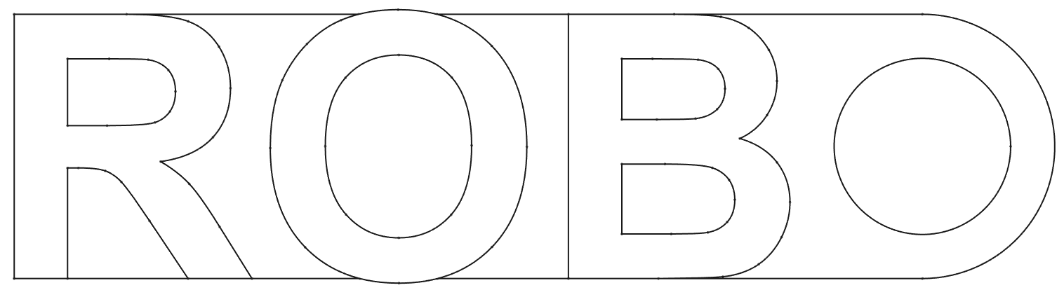
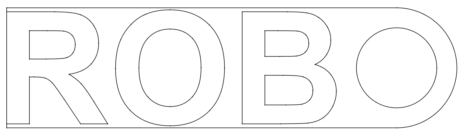
When I was making the tags yesterday I hit an interesting quirk of font rendering. My plan was to make my text exactly fit a tag by setting the size of the text to the height of the tag. This didn’t work because for obscure typographic reasons involving “making text look right” a capital O is rendered slightly larger than the surrounding text. As you can see above.
There were two ways I could solve this problem. I could check the height of each rendered character and scale it to fit exactly in the available height. Or I could just add a margin to the text.
I think I’ll just leave this here..


